








DAVENPORT
TALES
Summary
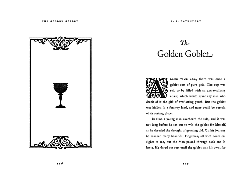
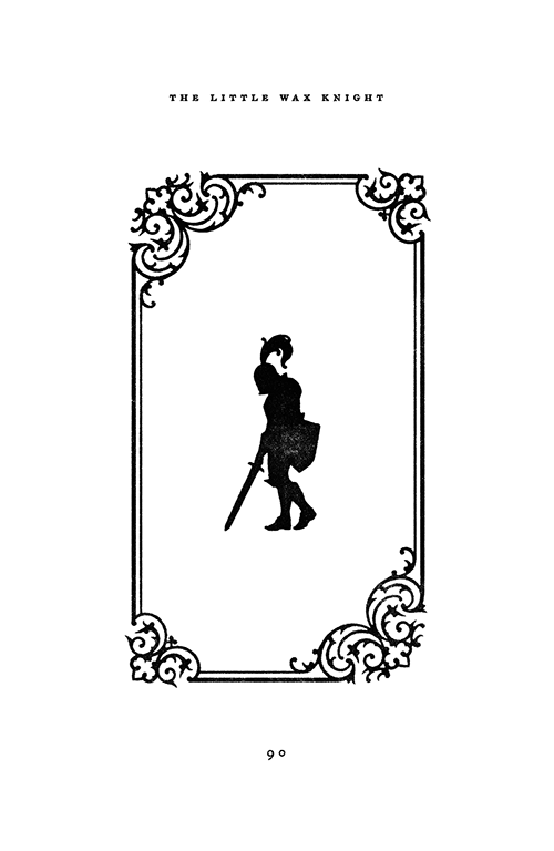
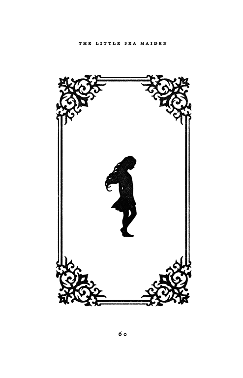
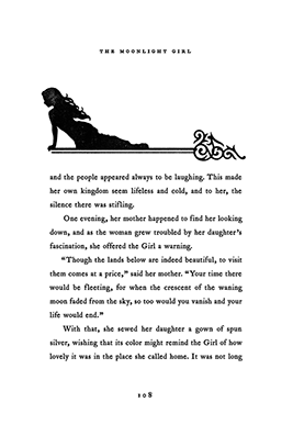
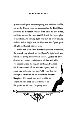
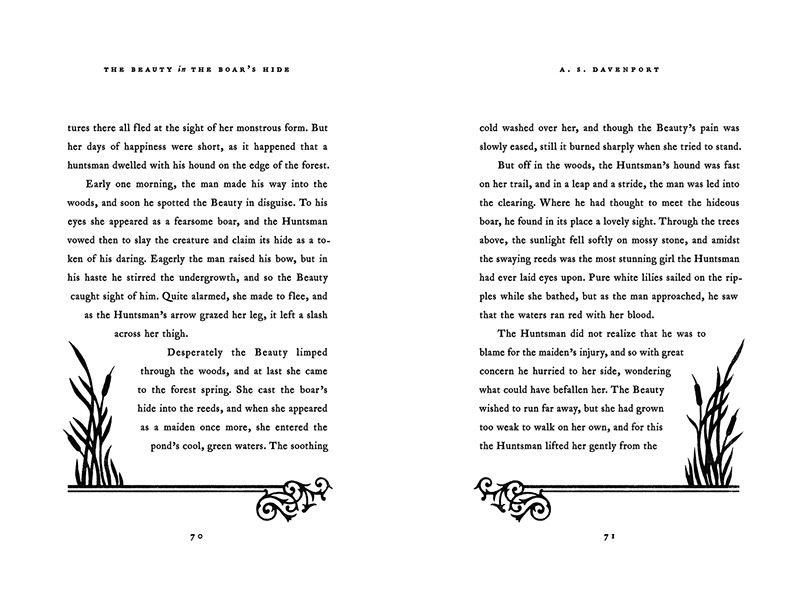
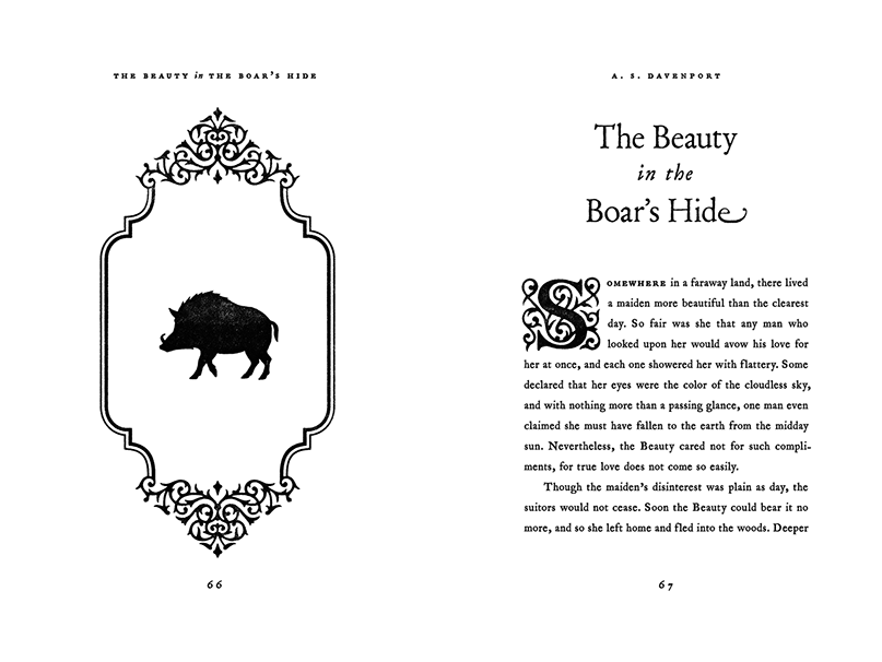
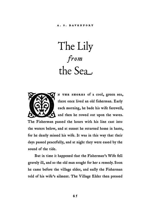
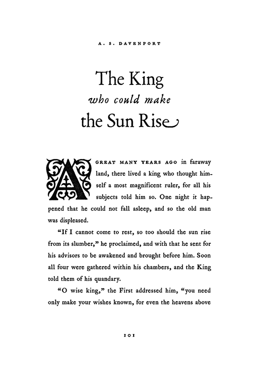
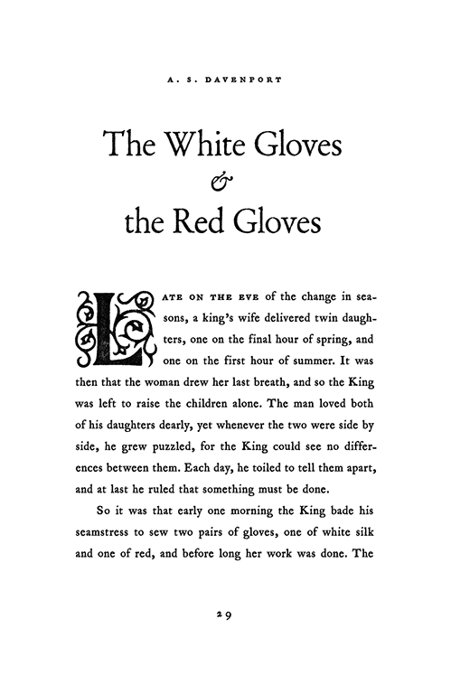
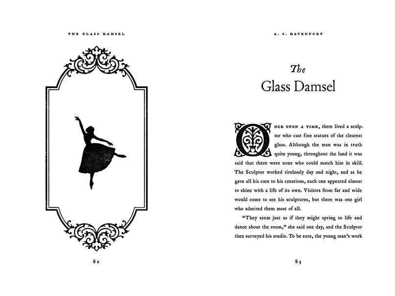
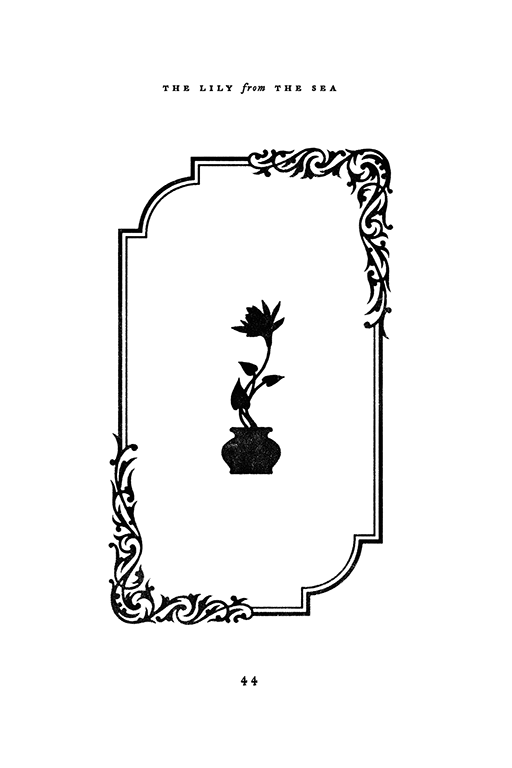
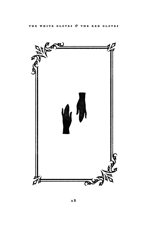
Debut author A. S. Davenport’s upcoming collection of fairy tales might be brand new, but needed visuals that felt like they were printed long, long ago. The first page of every fairy tale starts off with a silhouette of the most important image in the story. Every illustration features its own filigree design, and not one is repeated throughout the book. Aside from the 33 opening title illustrations, over 50 additional images are scattered throughout the book’s 200+ pages. Type wraps carefully around illustrations that sit within the text frame.
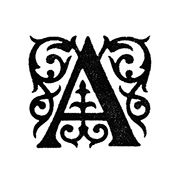
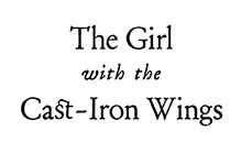
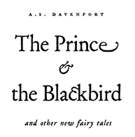
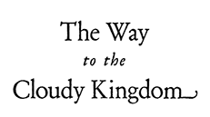
1689 Garamond by GLC was inspired by a set of fonts, designed in the Garamond style, used for an edition of “Remarques critiques sur les œuvres d’Horace,” published in Paris in 1689. Titles are typeset using historical swashes and ligatures. Old-fashioned block capitals underscore the first word of every fairy tale, with small caps to offset the opening phrase.
Initial concepts for the book were in full color, but we eventually landed on a black-and-white look that felt more reminiscent of the early days of printing and typesetting. Book photographed by Zach LaMance.
SAMUEL MOORE
© 2020 Samuel Moore