








Next
Prev
GOOD DAY
GOLDFISH.COM
Summary
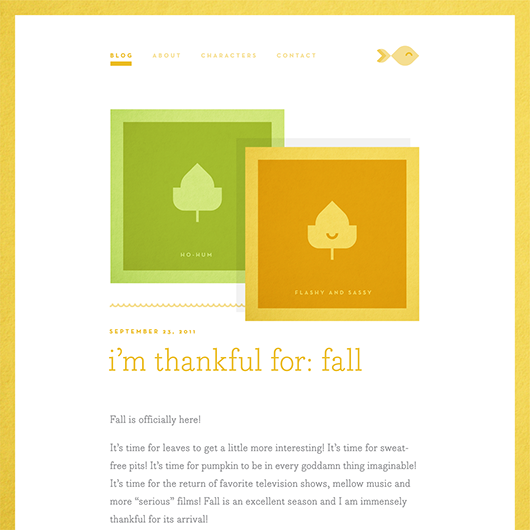
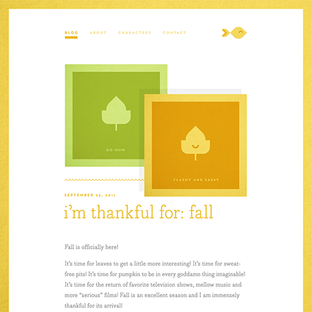
The blog’s brand features all-lowercase logotype and headlines that come across as lighthearted and friendly—complementing the author’s irreverent voice and wit. This treatment also reflects the digital feel of a URL, humanized by the use of Bodoni Egyptian. Coarse, calculated geometry gives way to an image of a cheerful goldfish, which echoes the mix of irony and sincerity that drives the blog’s content.
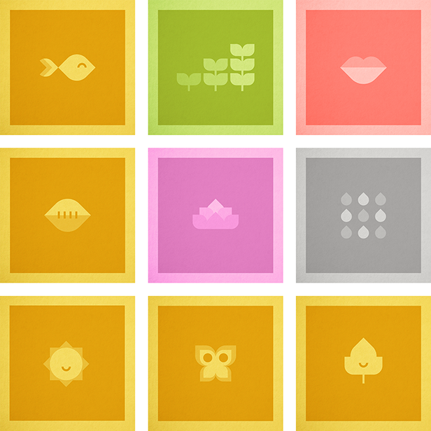
Elements from the logo can be used individually to form playful patterns, such as a school of fish, scales, or waves. The icon’s uncomplicated, geometric design also facilitates the creation of an array of illustrations, constructed solely from combinations of the forms found in the logo. These illustrations accompany and add interest to blog posts, establishing a visual shorthand for use in thumbnails and social media share links, which all feel distinct to the blog’s brand.
SAMUEL MOORE
© 2020 Samuel Moore