

LIVE WELL
LLC
Summary
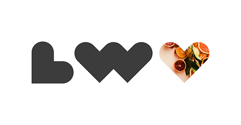
The name ‘Live Well’ originates in the names of the owner's sons—her inspiration for founding a company dedicated to the mental and emotional development of young men and boys: Oliver and Maxwell. Live Well LLC’s primary brand features an all-lowercase, serif logotype, paired with a bold, geometric monogram—a juxtaposition of old-world elegance and modern-day minimalism that’s timeless yet refreshing.
The monogram is constructed solely through the repetition of one simple shape: a heart which also functions as a sweet sign-off that maintains a sense of professionalism due to the straightforward geometry of the shape itself. This monogram approach is also applied to the mark for the accompanying Purpose Lounge podcast—a P and an L are formed using the same heart-shaped icon, establishing a unified visual framework for the Live Well brand.
The heart icon itself may typically be thought of as traditionally feminine, but the strict geometric construction in this design, plus the use of the color blue, both serve to recontextualize the symbol and create an intriguing mix of masculine and feminine energy perfectly suited to the company’s mission.
SAMUEL MOORE
© 2020 Samuel Moore