
WAG HUMANE
Summary
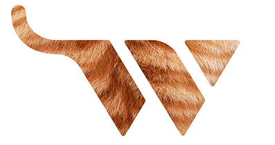
The mark for Wag Humane is both a monogram and icon—the letter W and a symbol we called the Critter, a shape that gives the viewer the option to choose whether it’s a representation of a cat or a dog. The tail in the mark can be seen as either a typographic swash, or a pertinent representation of the shelter’s name: Wag. The slab serif logotype reflects a trend in animal shelter brands, which—from a brand strategy standpoint—is effective in communicating a modern yet friendly feel.
The icon can also be filled with close-ups of various animal markings, such as a golden retriever, an orange tabby, or even a Dalmatian, depending on the messaging needs of the brand application. Flock printing adds a tactile element to the visual identity, inviting viewers to engage with the brand in a fun, childlike way that ties into the shelter’s mission.
Designed while at Phinney Bischoff. Naming by Phinney Bischoff.